Monday, 2 May 2016
Sunday, 1 May 2016
Evaluation 4
 Me and Alfie used a lot of technology to create our A2 short film 'Tempore Exitus'. Due to our genre (Sci fi) we had to be quite dependent on technology as we needed to create a lot of special effects and try and push the surreal element of Sci fi with things such as editing and the correct camera angles to make the effects look effective and most of all realistic. From the very start of creating the short film me and Alfie knew we wanted to concentrate on special effects and we knew we had to find the right technology before we started planning so in the planning stages we researched using Youtube. We used the popular video sharing site for researching into short films much like ours to get inspiration, also try and establish a complicated plotline which is interesting four our audience and also to try and work out how they did certain effects. Once we did this research on short films we knew what type of effects we wanted so we needed some help creating these, so again we researched into special effects such as super speed and time travel effects on Youtube to work out how to make our own special effects from scratch and this helped us a lot in making these as we now had our own unique effects with inspiration from other short films.
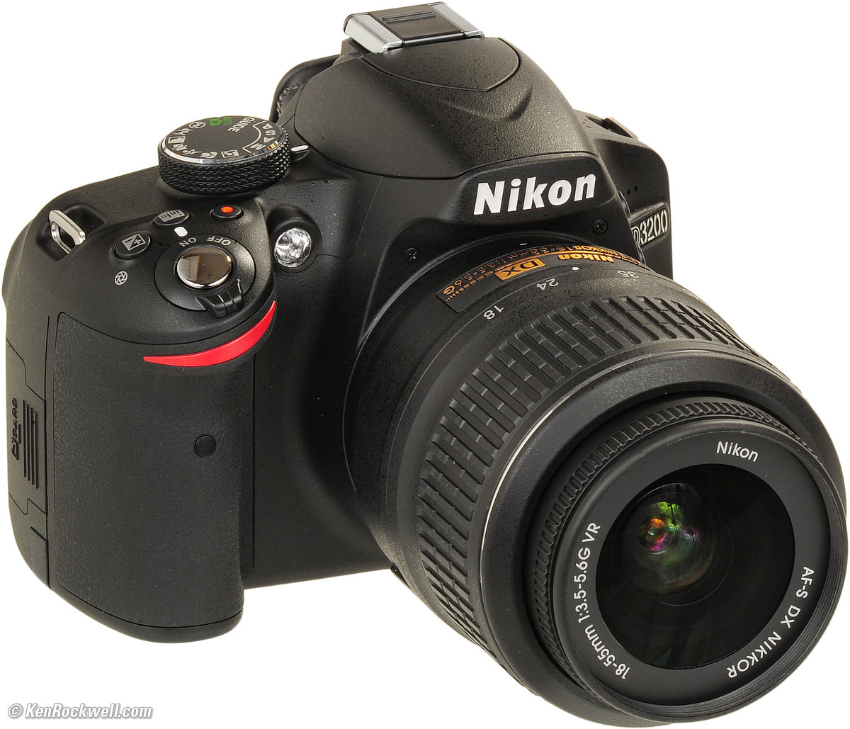
After this stage we planned the location shoots using google maps and with street view on there we established a great location spot we could use without even being there to decide and went out to film with one of our most vital pieces of technology in our short film which is of course the camera. We used my own personal camera which is a Nikon D3200 DSLR. We chose this camera because we did not have to rent it out from school and it has 1080p HD recording on the camera so it was perfect for our film. We also used a tripod with it to stabilize a lot of our footage which helped us achieve a smooth and sleek look to our film in the parts we needed the camera to be steady. We also used the tripod for some crane shots in which we raised the tripod in the air and recorded it midair to give the crane effect. In AS we both never really expanded on our creativity with the camera and in A2 we wanted to create some unique and interesting camera angles with this camera.

 I also used Garageband IOS on my ipad to create our soundtrack or the title sequence. In AS i just got copyright free music from Incompetech. However in A2 i wanted to step it up as i wanted to have a go at making my own from scratch soundtrack. Ideally i wanted to create all of the music in our short film but this was too much of a task for the amount we had to produce our film and edit it all within the deadline. So after compromising with time me and Alfie decided to simply create the title sequence soundtrack. As seen above there is the IOS version of Garageband in which i created separate instrumental tracks to form a tune for the title sequence. It took me several hours of experimenting with different instruments and tunes for each track but eventually me and Alfie decided on the final track to use for our titles. Another way i created something new was Photoshop in which i created the Ancillary products. In AS we didnt create ancillary products such as posters and magazines but Photoshop helped me create four posters for our film and magazine review pages with ease. I had no Photoshop knowledge in AS but after time in doing photography i have learnt the basic of Photoshop and a few handy tricks again using YouTube.
 Friday, 22 April 2016
Evaluation 3
This is my questionnaire for our audience feedback to tell me what our audience thought about mine and Alfie's short film and my ancillary products (Poster and magazine review page). I planned this questionnaire a fair amount in advance and i wanted to get a range of people ranging from 15 to 20. So in this survey i asked people both on social media and in person to collate a good range of answers. One key thing i wanted in these results was a comparison between two factors, 'Boys and Girls' and 'Ages 15 - 20 and Ages 21 - 25' as this is our main target audience age range. So to make this even on both sides i decided i would ask 16 people to answer the questionnaire, four boys 15 - 20 and 4 boys 21 - 25 and the same with the girls. Below is the questionnaire asked to all 16 people.
| Did you enjoy the film? | Yes | No | Partly |
| Did you follow the film easily? | Yes | No | Partly |
| Were you shocked by the plot twist? | Yes | No | Partly |
| Were the special effects effective? | Yes | No | Partly |
| Did the sound fit well in the film? | Yes | No | Partly |
| What did you think of the length of the film? | Yes | No | Partly |
| Did you like our title sequence? | Yes | No | Partly |
| Did you like the ending of the film? | Yes | No | Partly |
| Do you like our official poster? | Yes | No | Partly |
| Do you think it represents the film well? | Yes | No | Partly |
| Do you think it looks industry standard? | Yes | No | Partly |
| Do you like our Magazine review page? | Yes | No | Partly |
| Do you think it represents the film well? | Yes | No | Partly |
| Do you think it looks industry standard? | Yes | No | Partly |
| Do all of our products fit together well? | Yes | No | Partly |
So from this i wanted to create a visually pleasing, creative and easy way to see the overall results. So after consideration i chose to use Infogram which lets me create info graphics on the results. Below are interactive infographics on all questions. (Please press the small buttons to see all target audience groups as it is fully interactive). After the first three i felt it was no longer important to ask the different ages so it simply went to boys and girls.
Evaluation 2
Me and Alfie created synergy between our three products (Poster, Magazine, Final Short Film) using a range of codes and conventions from other films for inspiration and also by trying to create a totally unique atmosphere and tone in all of our products. We firstly created the short film and as we polished it up in post production we added many filters testing to see which one is best for the overall look and feel of the short film as this was extremely important to us as we wanted a unique way of showing our film.
Firstly one key element to all of our products is that they must have the same dark tone to each photograph or footage of our film. Every shot in our short film is colourised darker than the original shots we took on location. We used a range of filters to achieve the right feel for each individual scene instead of just sticking one filter over the entire film. We used filters on Premiere Pro such as 'Cinematic one' and 'Cinematic two' which both have a darker cinematic feel to them. We also used the 'Dreams' filter for the reverse time effects to give a dreamy and calm tone to the scenes. We carried this across from our short film to our ancillary products. We applied the same logic we did with the filters as we colourised both the poster and the magazine review page darker. In the magazine review page we wanted to keep Katie's character lighter as we want her to seem the hero (The lighter tones suggest she has a bright persona and is a good person) but then we darkened both Charlotte and Malachi using a vignette on the sides to show they are less important in the plot and it centers around Katie but also that because they are still there in the main poster they have significance in the story. We also did this in the poster as we have the colours going more towards the purple side of the spectrum but i have darkened the original portraits as again i wanted to keep to the 'Dark' theme that the short film. The poster was completely centered around the colours of purple and white to keep it simple and also very much a link with our Sci Fi style title sequence which is inspired by Sci Fi tv shows and films which is all purple and black. Purple and pink are the key colours in our film and as shown in our magazine and poster the main title is all purple and has a lighting effect applied over it so it isn't a blank base colour and makes it a lot more aesthetically pleasing.


We also created synergy between all three products by using familiar locations in our film as the locations for a our magazine review page and poster. The magazine review page's location is the location where most of the film is spent and that is the field that our main characters run across and where Charlotte's character meets her untimely death twice even though it isnt too visible with three of our characters spread across the page. The posters location is a bit less realistic and is the vortex we created for our title sequence. We wanted the background to be this to really give off an immediate sci fi feel to the poster and attract Sci fi fans to it with a glimpse. We also used it because it represents our film very well as it has the conventions of a wacky time travel sci fi within just rhe background and the three characters represent the key love triangle and drama which goes on in the short film.
Another key thing which links all of our products is the main font that we use in almost each promotional or media based product for Tempore Exitus. The font is called Star Avenue and is heavily inspired by the famous Sci fi film 'Star Wars' font. The font is used in our title sequence for the main title giving the short film an iconic title with the additional lightning across the 'X' creating a symbol and icon for Tempore Exitus which makes the short film across different products recognizable as mine and Alfies'.
Monday, 11 April 2016
Monday, 4 April 2016
Final Film Review page

We chose this magazine review page because it introduces all three characters and it represents the characters perfectly. (much like the official poster did). Also it feels like this hints at the love triangle but doesn't give it away too soon so the audience will still have the surprise when they watch the short film.
Friday, 1 April 2016


Monday, 21 March 2016
Final Poster

We chose this poster as our official poster because it is visually striking and it has the overall atmosphere and tone of the film Tempore Exitus. It includes the title sequence and all three characters which are all represented in this poster exactly how they are in the short film.


Sunday, 20 March 2016

Wednesday, 16 March 2016

Tuesday, 8 March 2016


Magazine analysis - Star Wars Rogue One

The genre of this magazine is a specialist film magazine specializing in getting exclusives of new upcoming films. This magazine analysis is a bit different as this isnt necessarily an analysis of a review page its more of a 'looking forward to' or a hype building article to get fans excited about the new Star Wars spinoff. Their target audience is mainly going to be young adults ranging from around 14 - 26. This particular page is aimed towards fans of the Star Wars franchise as it is shows a lot of references to the franchise and it is trying to catch the fans eye with the Star Wars logo in the bottom left.

The colour used in this magazine is very dark and edging towards a cool blue tint to all titles and also the primary image. This slightly hints at the darker plot as it is suggested by the mise en scene (Darker colours and rough clothing). The color is used to fit with the genre of the film which is sci fi so the magazine emphasises the fact this film is very techy with the bold perfect edged font and light blue symbolising electricity and many people associate it with technologically advanced things. The titles stay in the bold clean font throughout and much are very much like the iconic Star Wars titles but of course different enough to differentiate between this spin off film and the main franchise 7 (so far). This huge writing isn't actually the title of the film as the film is called Rogue One. This is more of tagline to catch star wars fans or regular readers eyes. It also has a small summary of what the more detailed paragraph is about to intrigue readers and get them to read the more detailed writing. There is also a small text box to describe what is going on in the picture in a small summary.

Magazine Analysis - MAD MAX

The genre of this specific magazine is a specialist film review magazine. This is a full detailed review of the film and isn't representing the genre of the film very much as it has no designed format which suggests what this film is about apart from the limited images which are not very intriguing. The magazine is very professionally and has no huge appeal to younger audiences as it is very bland and simply there to be a review and has no other purpose. The target audience i would say is for older people ranging from 20 to 40 as it is very professional and has no experimental or fun elements to the layout at all. The images are laid out very basic and it feels like they are there to simply take up some space at least catching fans of Tom Hardy attention or MAD MAX franchise fans.
 However the magazine does give a lot of information and due to its basic text and images it has a lot of room to put extra quotes from reviewers and plenty of space to actually review the film. The colours to this piece do not seem to match up at all to the genre of the film as MAD MAX is this dirty sandy landscape and this magazine is clear white putting a huge juxtaposition against this magazine and this film. The image they have used does some up a lot of the genre of the movie being action and thriller but it does not include one of the most essential parts to the plot which is the use of cars, trucks and motorcycles which most of the film is spent on.
Monday, 7 March 2016
Production Problems - Hair colour change
Mid way through filming Tempore Exitus our actor Katie Wright changed her hair colour so clearly it did confuse the continuity of the film slightly. Me and Alfie originally filmed an extra darkroom scene where it establishes between the gunshot scene and the meeting of herself scene that there was a 6 month time gap but we decided to scrap it as we felt it was not needed. To disguise this change we added filters to film so that the hair colour is very difficult to identify the change in hair colour suddenly and hopefully the audience will not pick up on this continuity error as we have applied filters so her hair will look identical to as it was in the scenes before.
Production Problems - Actor Change (Name Change)
Due to timing arrangements and other commitments sadly both Bridie and Ella could not be our actors for this project. After consideration me and Alfie chose Katie Wright and Charlotte Fensom as our brand new actors for Tempore Exitus. We also considered a new actor for the minor role of Jack which was originally going to be me but after discussions we decided Malachi Dempsey Clark will be taking the role allowing me to get behind the camera and concentrate less on acting.


In addition to changing the actors we changed the names of the story to Katie and Charlotte to simplify things when filming and we considered these names originally so it fit perfectly with the film and we never found much importance with the names of the film as it is already complicated as story.
Poster Analysis - Star Wars:The Force Awakens

This movie poster is for the seventh movie in the Star Wars franchise (The Force Awakens).
First of all the mise en scene sets the main plot up immediately establishing the heroes and villains but also establishing all of these characters as main characters but has a strong empthasis on the women holding the staff in the center of the poster showing her importance and most things will enter around her. Mise en scene is used firstly in the costume showing bright colours for the heroes in the poster but the main antagonist is clearly shown in the dark black ropes and hood with a haunting non human mask either suggesting he isnt human or does not have any emotion and distances himself from humanity. Also the mise en scene establishes the sub genre of the film as the poster is covered in weapons ranging from futuristic swords (lightsabers) and blasters showing there will be a side of adventure and action. The clear genre of this film is established as Sci fi from the spaceships, futuristic weapons, Robots and the space background clearly showing where its all set as it wont be set on earth. This all suggests sci fi and a lot of sci fi films have based themselves around the conventions in the classic star wars.
The titles are bold and we have a very similar font to this one and it is very iconic for the entire sci fi genre as a lot of sci fi movies took inspiration from the classic star wars movies. So not only does the title suggest the sci fi genre, it also shows the fans of the franchise that this is the next installment and raises anticipation for the film. No actor names are on this poster so it also emphasises the fact that these characters are all important. The poster also emphasises the split between good and bad with the colouring of each sides as the left side is a dark haunting red and the right side is a cool blue for the lightside and suggests the good side. This poster is clearly the main promotional poster for the film.
The plot of the film is highly suggester through all this mise en scene and editing around the characters. The main plot shows there's a split between the light side and the dark side (Good guys vs bad guys) and it is an intergalactic battle. This is also highly suggested in the titles (Star Wars) literally meaning a war in space between the light side and the dark.
Friday, 4 March 2016
Poster Analysis - Total Recall

This film is called Total Recall and it is the reboot of a classic film. Immediately with the man at the front is establishes the main character of the film. The genre is also clear from the first glimpse as the background has clear connotations of the future or another world as the background is covered in floating futuristic buildings and big ben shows us that this is still set in London but suggests a future version of the city and highly technological future compared to dystopian futures such as MAD MAX. So the genre is clearly shown as Sci fi due to the futuristic and technological advances. It also shows a sub genre which is shown by the mise en scene in this poster which is action and possibly thriller. So immediately the audience are given a taste of how the movie will be set up in the future and that it is also a dangerous place.
The tagline also gives us a hint of what is going to happen but not too revealing so the audience is left guessing what this film is fully about. The editing in this poster is also made to give the audience a sense of mystery which is the pixel like squares coming off of the main character. The tagline and the editing fits perfectly questioning if this futuristic London is real or not and it seems like this will be a key plot and recurring theme in the movie. As some fans may know this is actually the theme recurring throughout the theme and the poser seems to suggest that the answer to 'What is real?' will be answered by the main character throughout the film so it raises a lot of questions throughout the audience and will hopefully answer them all within the film
This poster is mainly to introduce the key elements of the movie and is counted very much as a 'character poster' just to introduce the main character of the film showcasing the famous actor to get the audiences attention and show that this movie of hollywood standard having a very well recognised actor. The titles also give a sense of the future and it seems like its stainless steel but also quite scratched so its almost as if its suggesting the future isn't quite polished and as perfect as it first looks. The colours also seem to suggest the futuristic city setting as the colours are a darky cyan blue tone over the entire poster giving it a thriller feel but also a technological atmosphere being all steel like showing the advancement through using shiny metals and sleeker looking colours.
Poster Analysis - Mad Max

This is the promotional movie poster for MAD MAX: Fury Road. Immediately this poster gives the basic idea of the film being highly orientated around a desert like location and a strong empthasis on the vehicle side which is subtly hinted within the motorbike behind the two main protagonists. Another thing highly suggesting this is the huge trucks covered in traps and deadly weapons faded into the background. Also another hint to the plot is the costume design. The costumes are very roughly made and clearly made to look like their lifestyle is very violent and they are almost like scavengers. This is also shown within the mise en scene as the rifle the woman is holding looks to be made up of scrap metal and put together by her. The chains across the man's face show this man is dangerous as he has to be chained up and clearly with he gun in his hand he shows huge connotations that he is a highly dangerous criminal or very much an anti hero. The make up on the woman's face also gives strong hints of scavenging to live as she seems covered in dirt and nothing is delicately done much like the man showing further that this world in the film is a dark and dangerous place and is very different to where we live today either placing it in another world or a wasteland future.
This film poster for MAD MAX shows us that the genre is immediately shown as a Thriller/Action as the mise en scene of the costume being rough and ripped up showing they've been through a lot of action and violence. Also of course the guns they are both holding in two directions shows they are fighting off enemies together. The motorbike also giving us a sense of thriller because the car chases will change pace and will provide suspense and action. Also hidden within the poster are subtle hints to it being a part Sci fi genre as it seems to be different from our Earth so it is either placed in another world where their culture is different or a future version of the world as it cannot be in the past because of the cars and weapons.
The titles give also a strong sense of rough, torn and dirty locations as the titles are bright yellow and have stains all across them giving the audience an immediate sense of this world not being a perfect precise world and instead a sandy dirty and violent world. The colours of the poster are primarily orange and yellow clearly blending in with the sandy desert and stained clothing of the clear main characters. Also the tagline highly suggests that this world is imperfect and belongs to the mad and it is set in the future. So this further proves that the film is set in this dystopian worn and dirty world which belongs to criminals and mad men.
Wednesday, 2 March 2016
Subscribe to:
Comments (Atom)